Wednesday, May 25, 2011

Edward Mapplethorpe's Variations

Mapplethorpe, installation view


The Foley Gallery on West 28th Street has taken a big commitment to cameraless photography with their current, very elegant show of The Variations, a group of related chemigrams by Edward Mapplethorpe.

Mapplethorpe, Variation 10, 2011

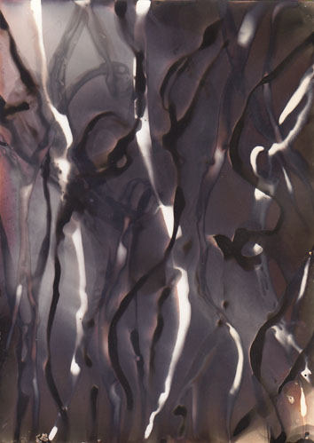
Mapplethorpe, Variation 3, 2011

The colors dazzle from the moment you walk in - yellows, oranges, red-browns enmeshed in swirls of black and white structural elements - and you fall into a kind of trance until you leave.  These are large works too, up to 42 x 64", and tactile: each is unique, and traces of developer are visible on the paper surface.

They seem to be made using the freehand chemigramic method we've alluded to occasionally on this blog; most recently, for example, see the work of young Kathleen Adams.  This means you paint, daub, drip or smear on your fixer and developer as inspiration dictates, going this way and that, covering your surface, each layer modifying the previous somewhat, and then you proceed very quickly until a final fix and wash locks it up.  Chance clearly plays a role, and the artist in the end makes creative decisions as to what works and what doesn't.  Although Mapplethorpe wouldn't comment, it appears to my eye that he also used some hydroxide and thiocyanate to inflect the colors (Adams does too), available from Arista or Clayton.  For paper, it's my impression he's using the large rolls of warmtone from Ilford or Kentmere.

Mapplethorpe, Variation 7, 2011


Previously Mapplethorpe had been known for rather haunting portraits of one-year-old children, their eyes precociously heavy with wisdom, as well as for abstract experiments in various darkroom techniques which earned him a certain recognition - but none of it presaged his current work.  The good news is that the current work is quite accomplished, much of it beautiful.  For someone who traffics in gestural imagery, Mapplethorpe is able to convey the verve and thrill of the approach while maintaining focus and control, thanks to a fastidious skill in handling large paper sizes, large trays, and no doubt gallons of chemicals, not an easy thing - just ask Pollock.

opening reception, May 12


The show runs till June 18.  We think you should bookmark this artist.

Tuesday, May 3, 2011

Glassprints and chemigrams from the 2011 workshop

During the month of May, Manhattan Graphics is hosting an exhibit that celebrates student work from the most recent workshop in glassprints and chemigrams.  You should see it - much of it is very inspired, even unanticipated.  Each year the emphasis shifts a bit in the workshop, reflecting the makeup of the new student group as well as fresh approaches to the teaching of the material, including reworked views of

Kathleen Adams, chemigram


David Thomas, glassprint
 

what that material should be. This year saw, on the glassprint side, a loosening of old restrictions as to what a glassprint represents.  Gone are the fusty rules about carefully mimicking, in brushed ink or smudged marker, a genre scene on acetate.  No landscapes are found here, no vases of flowers on tables with hunting horns.  I used to think that was good strong medicine but it seems the patient is cured.  Instead, we found greater freedom than expected with gobos (Andrea Matura) and scrims (David Thomas), sandwich compositions (Thomas again) and paper negatives (Matura again).  In chemigrams we did some of the usual dip n' dunk, spritzing on the hydroxide and the solvent, but we also got serious about hard resists, and many students went into their toolbox for intricate iconography.  The results show.  Paul Kleinman's resist-filled composition is outstanding; Kathleen Adams' flirt with dichroic dangers is a lot of fun too.  Here's more pictures from the show.

Eva Nikolova, chemigram


Paul Kleinman, chemigram


Andrea Matura, glassprint


David Thomas, glassprint


Paul Kleinman, chemigram


David Thomas, glassprint


Andrea Matura, glassprint


Kathleen Adams, chemigram

Friday, April 29, 2011

More tips on silkscreened chemigrams

Building on Rich's silkscreen post, we're going back to the studio for some additional silkscreen hands-on in a chemigram context.  But first let's ask ourselves: why bother with silkscreens at all, if ultimately we're aiming for a chemically altered work on photographic paper?  Two reasons come immediately to mind (later we'll think of others, but it may be too late for this post).  One, since silkscreen can be thought of as basically a stenciling process, as soon as our imagery gets complicated or uses repeated motifs it makes sense to invoke silkscreen as a convenient way to immobilize it, and to deliver it effectively to the photographic paper.  You "shoot" the image to the screen, locking it in place, and that becomes the delivery matrix.

figure 1

figure 2


In figures 1 and 2 we see a design created digitally (in this case) that has been transferred to a screen and squeegeed out onto photo paper, then finished as a chemigram.  In fig. 1 we started with fixer, in fig. 2 with developer.  Notice how, from a common starting point, the images evolved differently in the 30 minutes to completion, due to accidents, imperfections, and random effects along the way - interesting.  You'll want details: screen mesh was 160, Golden MSA was undiluted, the paper was Bergger.  Other choices of mesh, resist, dilution and paper will lead to other results even with the same initial silkscreen design.  Clearly, if you opt for a more viscous resist you may want a larger mesh, otherwise your resist won't get through; I've used a mesh of 60 for honey, which is almost a hardware-store mesh level for screen doors.

Another reason to use a silkscreen approach to chemigrams is to allow you to work with photographs.  Sure, you can always do a chemigram and over- or underlay a photo, but if you really want to mackie-ize it you've got to run it through a screen.  Here there are several options mostly involving photoshop and in the future we want to devote a post just to this.  To whet your appetite, we leave you with a detail of a Cordier photo chemigram, from that distant period before photoshop:

Cordier, Hommage à Nonyme 1972, 1976, detail

Saturday, April 23, 2011

Major glassprint show in San Francisco

Practitioners of the ancient arcane art of glassprints, or clichés-verre, can emerge from their darkrooms, squint and celebrate: a significant show of a spectrum of work in this technique has been mounted by the Jenkins Johnson Gallery of San Francisco.  Entitled "Cliché-Verre in the Digital Age" perhaps to dramatize how long it's been since the last such show, it features work by an international cast whose best-known member, to a New York audience, must be Abelardo Morell (see earlier blog post), but there are other fine contributions as well.  Here are three of them:
David Symons, 2009


Fredrik Marsh, 2000-2011


Suzanne Izzo, 2004

In New York we get a smattering of glassprint shows but no one talks about them much.  An exhibit of the Barbizon school clichés at the Peter Freeman, or a show on Roger Catherineau at the Gitterman, Corot and Millet at the Public Library, a few pictures by Man Ray at the Jewish, the annual class show of glassprints at the Manhattan Graphics Center - that's about it unless you expand the definition of what constitutes a glassprint.  Oh, and the Morells at the Benrubi.

With a show like this, much as it's belated and welcomed, one can easily overlook the fact that many artists not normally considered glassprinters (in fact not ever) but instead mere painters (though of some international stature) may glibly draw from the long history of glassprint methods to create works which the art press will later go on to identify as 'hybrid' or 'mixed media'.  Sigmar Polke, Gerhard Richter, Wolfgang Tillmans come immediately to mind, big names all; there are many others.  Just yesterday I saw an Anselm Kiefer at the Morgan Library that will blow your mind, but no mention of glassprint - yet it was.  The present group seems motivated by quite different concerns however, one of the main being their allegiance to photographic process not only as starting point but as the platform on which their final efforts are meant to be judged, and for that they signal by waving the cliché-verre flag.  They're not addressing the history of art with these works, generally: they've given that up, or maybe were never interested in that to begin with.  Maybe they're 'just photographers', whose conversation runs to filters and hydroquinone when they get together.  So soon we start asking how this or that picture is made, what are the steps, the conceits, the tricky sub rosa moves.  In addition to admiring, often - and we can't help ourselves - the arresting visual results.

For those unfamiliar with the scope of glassprint methods this show is a good place to learn, because it illustrates a broad range of technique, and because it's hard for the uninitiated to understand what you can achieve with just photo paper, developer, fixer, and a few household items (for the most part).  Schoolchildren should go - tell your teachers! - as should artists, scientists, collectors (never forget them) and the general public.  Once the surprise wears off, which could take generations, we can get down to accepting glassprint methods in a general approach to art.

Other exhibiting artists not mentioned above include Jo Bradford, Peter Feldstein, Maggie Foskett, Fred Parker, Frank Rossi, Käthe Wenzel and most especially Courtney Johnson, for bringing this show into being.  It runs from April 7 to May 3, 2011.

Monday, April 18, 2011

Coffee break

In a remote period before the birth of the prophet Mohammed, maybe in the 6th or 7th century, there lived, according to legend, in a place variously identified as Yemen or Ethiopia, a goatherd named Kaldi.  One day Kaldi noticed that his goats became especially peppy after munching the leaves and berries of a certain bush.  Kaldi grew curious.  He climbed the ridge, investigated, collected berries, then took them to the nearest monastery, a few days distant through the dusty haze.  On sampling the berries the monks were soon set frolicking more or less like the goats but - strangely - they also discovered a strengthened ability to concentrate on the sacred manuscripts, their assigned occupation.  Thus coffee was born, and from there the story of its paradoxical power spread across the earth.

Coffee, or more properly one of the scores of substances in coffee - caffeic acid? - is a reducing agent.  In the presence of the silver chloride or silver bromide in photographic emulsion, it causes electrons to pass to the silver, allowing the metal to stand alone.  It helps to have an alkali activator present as well, because this really only works at higher pH.  If we use sodium carbonate, commonly known as washing soda, a pretty good alkali, with some of Starbucks' Instant Italian Roast (Extra Bold), we get images such as figure 1.

figure 1

An observation is in order.  At the center of this image there is an area that resembles what is called dichroic fog, a fog generated by an excess of silver halide complexing agents in the developer.  We don't want to go too far into this - it's a fairly indeterminate subject anyway, the more so the farther you go into the scientific literature - but these complexing agents are often sulfur-containing compounds, where the sulfur gets exchanged for the metal, and the kinetics get kind of rapid and hazy.  Thiosulfate, thiocyanate, thiourea, and mercaptans are some of the many complexing agents that work with silver halides; another way to think of them is as silver halide solvents, which is why you find them often in fixer formulations.  In figure 1 we have mixed into the Starbucks a little thiocyanate.  If we keep at it but this time reduce the Starbucks a bit, and change the amount of thio and sodium carbonate, we arrive at images like figures 2 and 3.

figure 2

figure 3

These seductive colors are produced not by adding to the mix, but by pulling back from the dichroic edge with reduced aliquots.  A little practice is necessary, but is soon rewarded.  In the end, after becoming the ethereal colorist you've always wanted to be, you may wonder what the point of the coffee is: metol, hydroquinone, catechol and so forth are reducing agents after all that yield similar results.  Well, now you have a way to finish your cup, after it's grown cold.  And in your chemigrams there just may now lurk a hint of Kaldi's goats and their supreme vision.

Thursday, March 3, 2011

Installation view at HackelBury

When the Pierre Cordier show opened recently at the HackelBury Gallery in London, I blogged it and posted a group of pictures from among my many favorites in Cordier's work.  What I neglected to do was give a sense of the space the pictures were shown in, so here it is, an installation view of the main room as you enter.


If there is such a thing as a warm formalism, this must be it: impeccable framing, tasteful lighting, a procession of compact, powerful pictures drawing the eye toward the early evening sky above Launceston Place, an outline of clay chimneypots against deepening blue.  No bombast here, no cries, no shouts.

Friday, February 4, 2011

The Pierre Cordier year

HackelBury, the prestigious London gallery, has mounted a major and very timely exhibit of Pierre Cordier's work, overlapping with but not eclipsing the still-running V&A show, and not to be confused with the HackelBury booths at the AIPAD and Armory shows in New York at which we are promised still more Cordiers.

Cordier, egggram 1/6/65 I, 1965

This is the year for Pierre Cordier - and for chemigrams.  It's been a long time coming.

Cordier, chemigram 29/11/76 Mineral vegetable animal, detail, 1976

In a moment now legendary, Cordier hit upon the chemigram method one day in 1956.  Well - that's his story and it makes good copy.  But just as Newton stood on the shoulders of giants, so did Cordier have his antecedents, Teske, Kesting, Tabard, Chargesheimer, others.  Fox Talbot, in the opening pages of The Pencil of Nature, recalls his startling experience of stumbling upon color in silver salts in the year 1838 ("I discovered a remarkable fact of quite a new kind").  Cordier's insight, however, was to see what no one else saw: that photography is not just about looking and recording - he had done a bit of this himself in his early twenties, so he knew - but about evoking and extracting imagery that is essentially trapped, as a capacity inherent in material, within the physical and chemical confines of the very stuff of his art, the silver halide emulsion.  For him the artistic enterprise is always a dialog with the bruteness of matter.  That's where it starts and ends.

Cordier, chemigram 22/6/87, detail, 1987

He has spent a lifetime thinking about how to make a photograph from the inside out.

Cordier, chemigram 6/11/62, 1962


Cordier, chemigram 15/8/63 I, 1963

In the HackelBury Gallery, we are fortunate to have gallerists sensitive to the stunning beauty of these works.  I withhold my preferences: there is altogether too much wealth here.  Let it simply be said that the inspired, grueling labor that went into 'Mineral vegetable animal' (1976) will likely never be repeated.

Cordier, 15/8/59 III, 1959

How can we begin to learn from his work, his methods?  One way is through his writings.  His great monograph, Le chimigramme/the chemigram is the place to start; because of the 'Shadow Catchers' show, it's available at the V&A Museum shop in London and they'll ship anywhere in the world.  There's also Martin Barnes' catalog for the V&A, with an important chapter on Cordier, and finally, for those still needful, the in-depth interview with Cordier in the upcoming March-April issue of Photo Technique magazine.

In future posts we intend to examine aspects of the Cordier oeuvre, with some of the grit and the how-to, for the benefit of practitioners.  The lesson plan says to start by seeing this show.  It runs till March 31.