Showing posts with label Eva Nikolova. Show all posts

Saturday, November 26, 2016

Nikolova's method


Eva Nikolova, Untitled III, 2016
For a long time now I've wanted to get down into the trays with Eva Nikolova, and I know I'm not alone in this.  Folks have been writing me, stopping me in the street - ever since we began publishing her tortured paeans to memory, loss, and deracination, first in our post in 2013 and another in 2015 - to ask how she makes these pictures.  Some of the early ones looked like drawings with a smudge of chemigram thrown in, here and there, for mood, like Edmund Teske used to do in the 1960s in his faux-heroic portraits of Kenneth Anger, yet they were always beautifully and confidantly executed, charting a path of moral witness totally without precedent in cameraless photography.  When we noticed there were no people in these pictures (for even conventional war-zone photos coming to us from Aleppo had people in them, or their ghosts, adrift in the ruins) we grew to realize that here it was the artist herself who was the lone survivor of her particular armageddon, the one with the tale to tell, she who would live to imprint it with the human stamp.

detail, Untitled III

detail, Untitled III

Her methods have matured and will continue to do so, but her project remains.  This past summer she embarked on a series called 21 Fragments of Yesterday and Tomorrow, one of which, Untitled III,  was a selectee in the recent Alternative Process Photo Competition at Soho Photo in New York.  We decided to investigate what goes into making these pictures, just how they are formed.  Unsurprisingly, it turns out they begin as drawings (we were right), but the tools she is using now are chosen with a view toward a bleach-etch and glassprint endgame, so that as she works, photographic constraints and opportunities are forefront in her mind.  It's best to let her tell it.

'I start on a medium-weight drawing paper using graphite, charcoal, white chalk, and thin sharpies, often overlaid with a cross-hatch of white gel pens and maybe even a touch of white oil pastel.  I like to mix different materials when I draw, but because the visible tones of the materials do not coincide with their opacity - this is what matters when making a negative to print from - I photocopied the drawing onto ordinary printer paper, then contact-printed it under the enlarger.'

Since the resulting print had plenty of blacks, it was easy for her to bleach-etch, most apparent in the dramatic upper part of the picture.  The reader may wonder why the blacks in the lower part didn't bleach-etch as well and the answer lies largely in her strategy of mixing tones in the original drawing, that dense cross-hatch of white and black lines that she spoke about.  She articulates it so well: 'What preserves some of the blacks from lifiting off are tiny islets of white that act as anchors.'

Because the black areas therefore were impure, the etch was insufficient to affect them to any great extent.  Furthermore, she brushed on developer to these areas after the first etch to solidify the blacks found there.  For the upper part of the picture, the sky, now dense with veils, she delicately applied a weak and contaminated developer in an effort to bring out color, then left it to redden in the summer sun.

There is a lot to admire here for practitioners, and to learn from.  And we haven't begun to speak of the impact of her work on a viewer, which can be altogether staggering.

Contact the artist at her site, www.evanikolova.com for more information.

Monday, November 30, 2015

Cameraless at Soho Photo


Soho, New York City

Soho Photo, formed nearly half a century ago and still going strong, is a cooperative photo gallery tucked into Lower Manhattan opposite the ultra-hip Roxy Hotel.  Its shows are always of interest, and every year they put on an alternative process exhibition where you can view some of the best in historical methods: tintypes, calotypes, daguerrotypes, cyanotypes, gum bichromates, lumens, and (not so historical) chemigrams.  We went down to inspect the turnout this year and our eye was immediately lured by the cameraless end of the roster, where beautiful and accomplished chemigrams predominated.  Is it my imagination, or has the number of chemigrams represented increased over the years?  As I recollect, a decade ago they didn't even know what a chemigram was -  I phoned them back then and they had to look it up in a dictionary.  This year there were four chemigrams on the walls.  So, at this rate...


First, here is Veronica Hodgkinson with The Grid (2015), looking unselfconsciously minimalist like an early Cordier or, to make the point more emphatic, like a Carl Andre version from 1969 at the Tate in London.

Hodgkinson, The Grid, 2015
Andre, 144 Magnesium Square, 1969

If you love your chemigrams you'll love this one.  Each square seems to be relaxed about where its imagery is heading; nothing's in a hurry.  The chemistry and resist do the work, with Veronica looking on patiently, tweezers in hand, for the right moment to assist or not.  It's the classic look but I never tire of it.  Incidentally, the resist was not what you think: it was sticky labels - Rich will be excited to hear that - so we can assume the whole procedure took relatively little time, start to finish.  The paper was Kodak AZO, single weight, expired 1977, and her chemistry was from Sprint.

Hodgkinson, Losing It, 2015

In a somewhat different vein is Losing It (2015), a glorious, dancing bit of hybrid work, with photogrammed blots of human hair, presumably the artist's, merging with tiny pools of chemigramish material at each station of a balletic space.  It was created on Kodak Polymax II RC paper, expired 2003.

Nolan Preece is seen with The Clearing, a resist-driven piece, the tiny crackles and fissures in the surface amounting to a signature of sorts for the type of acrylic floor wax that he used.  The whole conception is simple and rather effective and quite welcome.

Preece, The Clearing, 2015
 Here's a detail from the lower left of the picture:

Preece, detail


His linework has an almost fractal quality, in that the closer you get the farther you see you must go to get it all.  It is this infinitely self-generating property of chemigrams and their resists that endlessly fascinates.


Eva Nikolova will not be left out, contributing a large paneled work entitled Tributaries (2015) consisting of 12 chemigrams 5x7" each on Dupont Defender Velour Black, expired 1944.


I never quite know how to talk about her work: is it history or geography, vision or curse?  Are these deep placid rivers draining a ravaged landscape to the sea, where it will be cleansed and renewed?  Like so many chemigrams, this one must be seen up close (maybe at 3 inches!), so we will look for clues there.  Especially telling is the deft treatment of her trademark resists - peanut butter, guava paste, marshmellow fluff (see the previous post), but for us they both reveal all and hide everything as quickly.  And like in Preece's work, the closer you get to it the more you realize you don't know anything.  It's that damned fractality of chemigrams that gives us amazing work like this - in part, but the rest is pure Eva.

Nikolova, detail

Nikolova, detail
veronica-hodgkinson.com
nolanpreece.com
evanikolova.com
sohophoto.com

Friday, November 13, 2015

A recent chemigram workshop at ICP with Eva Nikolova

figure 1

At the last minute, Rich Turnbull, my usual co-conspirator and fellow chemigram artist, couldn't make it - they needed him at the Metropolitan Museum to lecture on some bizarre topic that he's expert on, or soon would be if you gave him an hour or so with Wikipedia.  Rich is their back-up academic star and they know it, which, if I were less diplomatic, I would call star abuse.  So I had no choice but to turn to Eva Nikolova to fill in for him and what an unexpected surprise that turned out to be, though I'd had inklings of what was going to happen: I'd seen her work in shows around town for several years, her scarred depictions of ruined dream cities made of the most chaste of materials, and had become a big fan.  What I hadn't counted on was how ready she was to communicate her secret processes to the New York public, for that was to come.

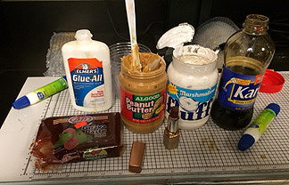
In our little chemigram community, Eva is known for introducing strange new products into the process such as guava paste, marshmellow fluff, peanut butter, lipstick - the list goes crazily on.  If you divide chemigram resists into hard and soft depending on the length of time it takes them to loosen their hold on the photographic paper, the items in Eva's toolbox are all soft resists, which can be used separately or together with 'traditional' soft resists like PVA glue (Elmer's glue) or Karo syrup.  Some are displayed in figure 2, waiting for students to overcome their uncertainty and try them.  Most definitely, Eva is not a purist.

figure 2

Herewith I give you samples of the work our group turned out by day's end, much of it fascinating, all of it entertaining; space limits me from showing more but I could.  As facilitators and guides in this, our job is to point the students in certain directions, show them established methods, suggest possibilities, and then let them have a go at it.  At first they proceed tentatively, feeling their way along, but soon enough they find the handle, or a handle, and begin to assert themselves.  One of the joys of teaching this is to watch the inventiveness of these encounters, student to photographic paper, with their quirks and the individual trace of their personalities, as they embark into regions not only unknown to them but, we soon realize, oftener than we like to admit, to us as well. 

figure 3


figure 4

Here's one that's as rich in depth as you could want, done with what appears to be a combination of guava paste and peanut butter - correct me, readers, if I've got this wrong.  Any lipstick?

figure 5

There's more.  Figure 6 (fig. 1 and 3 as well) shows the rich dark reds obtainable from certain vintage papers, dating from those golden days before papers got their cadmium reformulated away (see our post on this here), not to speak of other mystery substances.  Taking a page from Alison's notebook, Eva thoughtfully provided us with a bounty of gifts: Kodabromide E4 SW expired 1941, Kodabromide F-1 Glossy DW expired 1967 ("dreamy blues, lavenders, silvery greys" says Eva), Dupont Defender Grade 3 DW expired 1951, and Ilford MG 26K FB Velvet Stipple DW expired 1962.  It makes my eyes misty to think about it.  My contribution was the comparatively prosaic Adorama FB Glossy and Fomatone FB Matt, with odd leftovers of Ilford thrown in.  


figure 6

In figure 7, note the canny use of the remaining hard resist (Golden MSA varnish) as design element on a piece of Ilford FB paper.  Most would have continued until all the resist had lifted - I might have too - but not this artist.  A nice call indeed.


figure 7

Figure 8, below, shows what can be done with PVA glue if the snatch point is carefully calculated - by intuition of course.  If snatch point isn't already a keyword in this blog, let's make it one.  That's the moment, usually quite early in the tray dance if you're using soft resists, when you snatch the paper out of one chemical very quickly and thrust it into another, in order to suddenly arrest the action.  A matter of seconds can make all the difference.  In the lower part of the picture observe the white skid marks from the hydrodynamics of a sudden thrust into developer from a fixer launch.


figure 8

We can learn something from each image we present - each has a tale to tell.  For now, pay particular attention to figure 9, where two thickly slathered arrays of Eva's resists have received the same chemical attacks.

figure 9
In one peanut-butter is the main actor, in the other it's lipstick.  Here's a detail of the upper part:

figure 9, detail

Let's look at more work, picking them almost at random.  Here's a soft-resist I like.

figure 10

And another, with hybrid marks drawn from different traditions.

figure 11

Sometimes, the softest marks are those that stay with you the longest.

figure 12

Participants included Mary Alestra, Michelle Bratsafolis, Carol Chu, Sarah Davis, Mira Dayal, Nadezhda Neusypina, and Kiera Wood.  Hats off to all!

                                                   *  *  *

For those interested, Rich Turnbull is doing a chemigram workshop on November 21 at the Penumbra Foundation, just 8 blocks south of here in midtown Manhattan.

International Center of Photography  
www.icp.org

Eva Nikolova
www.evanikolova.com

Penumbra Foundation
www.penumbrafoundation.org

Douglas Collins

Saturday, October 26, 2013

Chemigrams in Prague and Brooklyn

Collins, Colorchart, 2012
If you were in Prague this fall and found yourself along the embankment called Smetanovo Nabrezi near the Charles Bridge, you could have taken a moment to drop in to the Hollar Gallery to see the New York printmakers show, which ran from Sept 18 to Oct 13 2013.  One of the works on display was a chemigram, Colorchart (2012) by Douglas Collins.  While there are many different ways to make a chemigram, this work is a good place to start in trying to understand some of the standard chemigram methods and strategems, as least as practiced by myself, a few but not all of my colleagues, and a number of my students.

The pictoral space here is organized as a grid, for simplicity - not a requirement but that's just how I often work.  My goal was to generate a random sequence of colors by allowing the chemistry in my trays, fixer and developer, to chip away at the tiny silver halide grains in the emulsion, changing the ways these grains refract light and thus selecting for certain wavelengths.  Since I knew we were going to generate an array of colors (geeky is good, but for a refresher look up the Mie effect on your own: it would take us too far afield in this post), what better way to think of it than as a color chart?  We're half way done.

The photographic paper I chose was Ilford FB warmtone and I coated it with MSA varnish by Golden - undiluted in this case, although dilutions are certainly permitted and can lead to different results.  (Actually everything is permitted but that too is another, quite wonderful, story.)  Once dry I incised in it a set of boxes, using a small blade, taking care not to go through the paper and prematurely end with tatters.  These boxes would become my color swatches in the finished work.

Next I proceeded with the 'dance of the trays', passing the prepared paper from developer to fixer to wash and back again - and again and again.  Did I say that all this can be done in daylight?  The basic chemigram method does not demand darkness, it's only in hybrid practices involving stencils, drawings or photo negatives that you may need to work under safelight, or in pursuing solarization effects or other variants; Christina Z. Anderson's book is a useful review of these methods.

After a certain time, when you start to think you screwed up and nothing's going to happen, things do happen.  Bits of varnish start to lift, at corners usually.  After a few minutes more will lift.  You can intervene here with a pair of tweezers and pull the rest off - or you can leave it to desquamate on its own.  If you decide to let the sections of varnish shed by themselves you will soon receive a bonus: the loose ends of varnish, flopping around on their tethers, generate a wispy color of their own, a kind of imprint of their brief existence.  That accounts for the strange outlines around some of the boxes in Colorchart and adds to the overall character of the work, a lyricism maybe, I'm trying to be modest.

Finally, when you feel the colors are right you plunge the paper, not without trepidation, into fixer for a last time, but be attentive here because the fixer may squelch everything, all the vibrancy you thought you had: some bypass this step and go directly to a long wash.  (See the post on Jeff Robinson, January 2011.)  Then you dry and you're done.

Nikolova, untitled, 2013
A very different way to make chemigrams is by using the so-called soft resists, materials that disintegrate or lift off almost immediately.  Eva Nikolova makes surprising use of some of them found in the local delis of her uptown Manhattan neighborhood, and in doing so has extended the expressivity of chemigrams in unforeseen directions.  "I draw," she says, "mostly with peanut butter and guava paste (a Dominican favorite), using pieces of mat board and credit cards, alongside the customary sticks and Q-tips.  The guava paste behaves exactly like honey except it has a stiff granular texture and doesn't spread, so it's easy to control.  What you are seeing is just the interplay of simple additive and subtractive drawing transformed by the chemical process."

I have to stop here: this is too astonishing.  To build the ruined cities that continue to haunt her, these fragments torn from dreams - go see the rest of her work on her website - with the most humble and ruined of tools gives the whole enterprise an unexpected pathos.  It is consummately eloquent.  It makes one think of Piranesi's Imaginary Prisons or maybe one's own nightmares, and yet it's a chemigram.


Piranesi, from Imaginary Prisons, 1761

Eva is showing some of her new work at the New York Foundation for the Arts, 20 Jay St, Dumbo, Brooklyn, until Jan 17 2014.


Tuesday, December 11, 2012

Where you can look at chemigrams this winter

Turnbull, numerical structure 2, 2012

The Hosmer Gallery is located at the Forbes Library in Northampton, Massachusetts, about a 2-hour drive west from Boston.  Very soon you'll be able to see some of Richard Turnbull's work from 2010-2012 there, in a much anticipated show running February 1 to February 28, 2013.  Am I giving it all away by saying that my favorite is the surprising, apocalyptic 'glyph studies 1'?

Turnbull, glyph studies 1, 2012
Meanwhile, down in Pennsylvania Norm Sarachek is having a show at Santa Bannon Fine Art in Bethlehem from December 7 to December 30, 2012, featuring his new 'Steel Works' series.

Sarachek, Steel Works 1, 2012


Sarachek, Steel Works 2, 2012

He follows that up with another show at the Perkins Center for the Arts in southern New Jersey which runs from February 9 to March 23, 2013, because you'll need to see more of this fine artist.

The inventor of the so-called chromoskedasic variation in chemigrams, Dominic Man-Kit Lam, recently concluded a huge show with over 100 works at the Shanghai Art Museum (China) this past October 2012 entitled 'Vision of Harmony'.  He also spoke at the event, and an inspirational video of it has been posted on YouTube.

Man-Kit Lam, from Vision of Harmony, 2012


Man-Kit Lam, from Vision of Harmony, 2012
Man-Kit Lam, installation view, Vision of Harmony, 2012

Back in New York, Eva Nikolova is exhibiting chemigrams from her new series 'Ordinary Disappearances', which offer imaginary but quite emotional Balkan landscapes from and about memory, triggered by a trip to her homeland after many years' absence.  The show is at the Grady Alexis Gallery in El Taller Latinoamericano in upper Manhattan and runs from November 26, 2012 to January 9, 2013.

Nikolova, untitled IV, 2012


Nikolova, untitled VI, 2012

A blog regular, Nolan Preece, is presenting both chemigrams and glassprints at the PUB Gallery, Wildflower Village, Reno, Nevada from November 29, 2012 to January 15, 2013.

Chemigramist Douglas Collins exhibited in the recent Alternative Processes Competition at Soho Photo in lower Manhattan from November 7 to December 1, 2012.  He will also be in the annual group show at the Center for Photographic Art in Carmel, California, from January 12 to March 1, 2013.