Wednesday, August 24, 2011

Lightfastness of chemigram colors

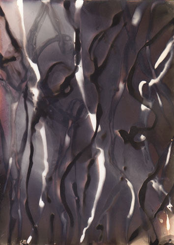
Collins, Study #14, 2011
We continue to think and wonder about the colors created in chemigrams, where silver halide complexes, embedded in black and white photo paper, can be induced to yield a gamut of colors from the subtlest pinks and yellows to the richest indigos and violets.  Of the many questions evoked by the chemigram procedure - and there are many - one is paramount not just to artists, the chemigramists themselves, but to collectors, dealers and museums, indeed to the whole enterprise, and that is this: how permanent are these colors?  Do they degrade over time?  Which colors change in hue and which do not?  Over what timescales do changes, if any, occur?

First, a practitioner's observation.  Chemigram colors do in fact evolve and mutate throughout the entire creation pathway, as waves of fixer, developer and byproducts besiege the emulsion.  This continues, muted, into the final wash and even to the drying.  We know it because we see it.  It seems to persist for certain tones right into the early days of the post-dry period, though we're not sure where that ends, so lowkey do the changes eventually become.  It could be related to how much silver halide still clings to the paper, or how complete the wash was.  But even discounting that, such changes are real.  That's why some chemigramists prefer to scan their work as soon as it dries, to ensure the vibrancy of the original colors is preserved.  Nothing worse than having your work disappear on you.

a QUV weathering unit
What about the longer term - years, decades - what happens then?  To help find an answer our colleagues in the laboratory at Golden Paints in New Berlin NY conducted lightfastness tests on chemigram samples we provided, using their state-of-the-art QUV apparatus.  This device exposes samples to UV radiation simulating indoor, gallery-lit conditions, but vastly compresses the timeframes: 400 hours of constant exposure in this box is the equivalent of 33 years in the real world (technical details are found on the Q-lab website).  We went for a century - a nice unit! - in three 400-hour segments, at the end of each of which the samples were withdrawn and compared to the original.  These comparisons could have been rigorously quantified in Cielab colorspace, the delta-E or amount of change could have been calculated, etc, but all we wanted was a first-look kind of result.  Here is some of what we found.


fig. 1

In figure 1 the upper right corner piece is the original; the three slices descending toward the left lower corner are pieces that received 400, 800, and 1200 hours of exposure respectively.  While difficult to see at the scale of this post, there is a slight loss of warmer reddish tones by 400 hours.  At 1200 hours there is an overall darkening, or perhaps dulling is a more accurate description, a vague muddiness.

fig. 2
In figure 2 the original is on the right, with progressive exposures increasing toward the left according to the technician's notes on the scan.  Of the many samples documented this showed by far the most dramatic changes, with the warm tones dropping out completely even at 400 hours.  The subsequent gray tone maintains its value, but darkens somewhat by 1200 hours.

It is true that the snippets sampled were not uniform or even systematic: chemigram tray time, paper type, wash time, idiosyncracies of the artists (several supplied samples) all varied considerably.  In addition, the UV spectrum used in the exposures may not be predictive of actual conditions in a gallery, where lighting can vary from fluorescent of various types to daylight.  And yet from this we feel entitled to form certain impressions - a sense of the slow degradation of the colors, some perhaps more than others, against a background of an inevitable increase in entropy.  Left unspoken is the mechanism for these changes, since chemigram colors owe nothing to either dyes or pigments but instead to the size of certain objects - polymorphic clumps of silver bromide or chloride - and the wavelengths of light reflected from them.  The Mie effect was mentioned in an earlier post, and will be revisited in the future.  Still, for now we can be cautiously optimistic in the belief that, if our chemigrams have not altogether gone bad in our trays before we hang them out to dry, they will be around in some form for quite a while, maybe a century.




Monday, August 8, 2011

The hand of Paul Bloomfield


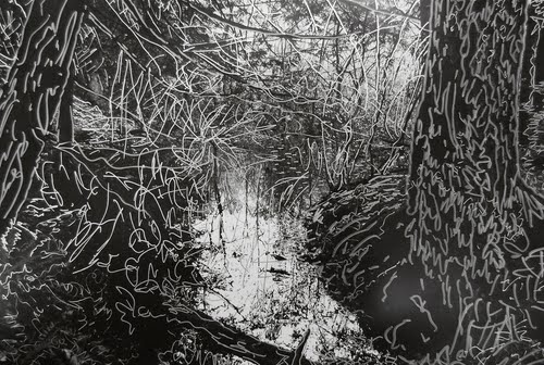
Bloomfield, Dark Trees, 2008-10, drawing on photograph

Bloomfield, Heaven and Earth, 2011, oil on gelatin silver photogram

One of my more serendipitous encounters this summer was meeting artist/photographer and teacher Paul Bloomfield at a monotype workshop at Zea Mays Printmaking in western Massachusetts. I talked to Paul about chemigram techniques and in the course of a discussion about the overwhelming presence of digital photography in contemporary life, he revealed that he has long been making what we might call manipulated or enhanced photograms in the darkroom as a way of counteracting the ubiquity of the straight photographic image. Paul's methods are quite diverse: he sometimes "paints" with developer in the darkroom on unexposed photo paper, guided by the intuitive gestural motion of his hand since he can barely see the mark of the clear developer in the dim safelight aura. Sometimes he draws on an exposed and processed photographic image with oil pigments or markers. Sometimes he is content with a straightforward but still inherently mysterious photogram, which most readers of this blog will know is an image generated by placing objects or filters/screens/whatever on photographic paper and allowing light from the enlarger to pass through or not depending on the object's transparency or opacity.


Bloomfield, Mayan Visions II, 2010, photogram

Paul's work incorporates pattern and elements of seriality or repetition as well as marks/forms derived from nature, which he claims in the modest artist's statement on his website allow him to meditate on systems, manifestations and impermanence. Some of Paul's work appears painterly and photographic simultaneously, which of course is the point: by reworking the lines and forms of a conventional photographic image through applied pigments or markers, for example, Paul reclaims the space and "trajectories" in the image from the otherwise inherent flattening quality of a photograph. (This is indeed the case in "Dark Trees," seen above.) The resulting work is a hybrid form that while not necessarily new (photographers have drawn on their prints before) suggests above all a reimposition of the hand in the photograph...which I've suggested in an earlier post is one of the strategies we might use to survive photographically in an overwhelmingly digital world.


Saturday, August 6, 2011

A word about greenery...

While spending a couple of weeks this summer at the wonderful Zea Mays Printmaking in western Massachusetts investigating green (i.e. non-toxic) printmaking techniques, an opportunity came up to show and share the mysterious beauties of chemigrams, which in turn led to a query about the safety of chemigrams and photographic processes in general. In a world where most of us are exposed to any number of potentially harmful substances on any given day, this is no small matter. I had to admit to my fellow printmakers that as far as I know, there is no green way to produce a chemigram. Even apart from the toxicity of developers and fixers used in standard black and white processing, those of you who have experimented with hard resists (e.g. the various varnishes discussed in many of the posts on this blog) already know that the only ones that really work are those soluble in mineral spirits (Golden's MSA varnish and Liquitex's Soluvar, for example) and that these varnishes in turn need to be diluted with mineral spirits (full-strength, not odorless and not Turpenoid, neither of which work) in order for them to slowly lift during the chemigram development process. Some of you have probably had the pleasure of experiencing a mineral spirits-induced headache after a night in the darkroom or the printmaking studio. The only thing I can suggest to health-conscious chemigramists is to make sure you have adequate ventilation in your work area (darkroom ventilation is a given must-have, even if you are just doing basic black and white work) and wear disposable gloves at all times. Do not mistake your solvent jar or container for your coffee cup in the dim light of the darkroom.

I would certainly be interested in hearing from anyone who has suggestions to make chemigrams greener (cyanotype chemigrams? non-solvent based varnishes?)...but I suspect it may be one of those processes, like traditional lithography, that carries with it certain hazards no matter what. A safety-conscious chemigramist is of course a happy chemigramist...

Monday, June 27, 2011

The iterative art of Brittany Nelson

Nelson, Mordançage2, 72x72", C-print, 2011

She started dismantling photographs around 2006, as a student of Christina Z. Anderson at Montana State.  She had lots of acid and copper chloride and hydrogen peroxide laying around, and stacks of photo paper, and a secret drive to be a mad scientist.  She continued at Cranbrook outside Detroit, in the MFA program.  Hmm - what if we just remove the silver gelatin emulsion from the paper?  What happens then?  And maybe re-stick it over here, on another piece of paper?  And then expose it to UV light, in increments?  Or maybe quench it in different redevelopers, for different times, and take notes on everything?

Welcome to the art of Brittany Nelson, featuring mordançage, or gelatin relief as some prefer to call it.  One of the few alt-photographic methods to have developed in the last century (along with chemigrams) rather than the previous one, it was mentioned at least as early as 1927 in Louis-Philippe Clerc's La Technique Photographique, but didn't receive much attention among fine-art photographers until Jean-Pierre Sudre rediscovered it in the 1970s.  While most applications have been possibly a bit too mundanely representational for Brittany's taste, she was pulled in by the endless possibilities for permutation of the variables, and for the pure physicality of the process.  You have to get very close to the materials for this kind of thing to work, and the bad part is they are largely poisonous.

Nelson, Mordançage3, 72x72", C-print, 2011

As a refresher, let us recall the basics.  A silver gelatin print is placed in a bath of copper chloride, glacial acetic acid, and hydrogen peroxide, which does several things at once: the print is bleached, the emulsion (mainly in the black areas) is gently loosened, and everything becomes soft, mushy and mobile, depending on the length of the soak, the H2O2 concentration, and so forth - some of Brittany's variables.  The CuCl2 acts as an etch and mordant, which has a further consequence of promoting color shifts upon re-immersion in developer.  At this point the image can be reorganized, the bleached areas can be left white or not, the options are many.  For an excellent overview see Anderson's page on unblinking eye, extracted from her essential Experimental Photography Workbook.  Jalo Porkkala has an outstanding bleach-etch page too on his Vedos site, where he runs you through actual examples of the possibilities, but one has the feeling that even he leaves off early, refusing any deep confrontation with materials at the exact moment where Brittany's odyssey begins. 

Nelson, Mordançage4, 72x72", C-print, 2011

What can we say of the images she has given us thus far in her young career?  It's as if they were lab reports from another planet, the result of tweaks of a strange parameter: wisps and banners of emulsion streaming and foaming, pointing to processes beyond our knowledge.   She goes to lengths not to be gestural, but in vain.  She is curious and obsessed and it shows.  The payoff is beautiful.

For more on Brittany, visit her website.  Notice too that, like others who work in mordançage (it's a niche activity, definitely) she scans her fragile, diaphanous work, to create the relative permanency of a digital file from which she makes chromogenic prints, truly monster ones.  New York would be fortunate to see these some day, and richer for it.

Monday, June 20, 2011

Chemigrams in the IPCNY summer print show


There's something special, or especially elusive, about chemigrams that makes them one of the hardest of art objects to pin down, for those who like to classify things.  Are they paintings?  Mapplethorpe's new show suggests they are: in gesture, scale, ambition.  Or photographs?  Well, they're created on photographic paper by manipulating silver gelatin emulsion with fixer and developer, so they have the parentage.  Or are they prints, with affinities to lithographs and etchings?  The summer New Prints 2011 show at the International Print Center of New York, curated by Trenton Doyle Hancock and running from June 9 to July 29, 2011, proposes the latter.  Prints are about process, where the methods and restrictions in creating a plate often determine what the image pulled from it will look like.  The layers of work that go into it, the hours and days of drawing and scraping on a plate, are part of this process too, so when we consider a print we must think about time, a time of creation, very legible in the finished product in front of us.  In his remarkable curatorial essay, available on the IPCNY website, Hancock speaks not only of this time but also of timelessness, the infinite continuum in which the print resides: 'I am humbled by its disregard for the now,' he writes.  Where prints come from is a sacred place, and their very existence can lead us beyond our limiting temporality.


Collins, Things to come and the ways of coming, 2010

The chemigramist, of course, understands this intuitively. He has observed the mysterious kinetics of what happens in his trays, the physico-chemical reactions.  He watches shapes emerge, morph, and vanish, only to reappear elsewhere or in other guises.  His hand is respectful as he lifts off resist; as an artist he is a minor player.  He influences, but someone else is at his shoulder, some spirit.  He knows this.  So it was perhaps no surprise that two chemigrams by Douglas Collins were selected for this show, and yet these are the first chemigrams ever displayed at IPCNY, a capital in the world of printmaking.  The old order is giving way to the new.

Collins, Gentle bodies, 2010

A technical word: these pieces used Golden MSA varnish and were printed on Hahnemuehle German Etch paper with an Epson Stylus Pro 11880 printer.

Collins on left, Hancock on right at opening

Wednesday, May 25, 2011

Edward Mapplethorpe's Variations

Mapplethorpe, installation view


The Foley Gallery on West 28th Street has taken a big commitment to cameraless photography with their current, very elegant show of The Variations, a group of related chemigrams by Edward Mapplethorpe.

Mapplethorpe, Variation 10, 2011

Mapplethorpe, Variation 3, 2011

The colors dazzle from the moment you walk in - yellows, oranges, red-browns enmeshed in swirls of black and white structural elements - and you fall into a kind of trance until you leave.  These are large works too, up to 42 x 64", and tactile: each is unique, and traces of developer are visible on the paper surface.

They seem to be made using the freehand chemigramic method we've alluded to occasionally on this blog; most recently, for example, see the work of young Kathleen Adams.  This means you paint, daub, drip or smear on your fixer and developer as inspiration dictates, going this way and that, covering your surface, each layer modifying the previous somewhat, and then you proceed very quickly until a final fix and wash locks it up.  Chance clearly plays a role, and the artist in the end makes creative decisions as to what works and what doesn't.  Although Mapplethorpe wouldn't comment, it appears to my eye that he also used some hydroxide and thiocyanate to inflect the colors (Adams does too), available from Arista or Clayton.  For paper, it's my impression he's using the large rolls of warmtone from Ilford or Kentmere.

Mapplethorpe, Variation 7, 2011


Previously Mapplethorpe had been known for rather haunting portraits of one-year-old children, their eyes precociously heavy with wisdom, as well as for abstract experiments in various darkroom techniques which earned him a certain recognition - but none of it presaged his current work.  The good news is that the current work is quite accomplished, much of it beautiful.  For someone who traffics in gestural imagery, Mapplethorpe is able to convey the verve and thrill of the approach while maintaining focus and control, thanks to a fastidious skill in handling large paper sizes, large trays, and no doubt gallons of chemicals, not an easy thing - just ask Pollock.

opening reception, May 12


The show runs till June 18.  We think you should bookmark this artist.

Tuesday, May 3, 2011

Glassprints and chemigrams from the 2011 workshop

During the month of May, Manhattan Graphics is hosting an exhibit that celebrates student work from the most recent workshop in glassprints and chemigrams.  You should see it - much of it is very inspired, even unanticipated.  Each year the emphasis shifts a bit in the workshop, reflecting the makeup of the new student group as well as fresh approaches to the teaching of the material, including reworked views of

Kathleen Adams, chemigram


David Thomas, glassprint
 

what that material should be. This year saw, on the glassprint side, a loosening of old restrictions as to what a glassprint represents.  Gone are the fusty rules about carefully mimicking, in brushed ink or smudged marker, a genre scene on acetate.  No landscapes are found here, no vases of flowers on tables with hunting horns.  I used to think that was good strong medicine but it seems the patient is cured.  Instead, we found greater freedom than expected with gobos (Andrea Matura) and scrims (David Thomas), sandwich compositions (Thomas again) and paper negatives (Matura again).  In chemigrams we did some of the usual dip n' dunk, spritzing on the hydroxide and the solvent, but we also got serious about hard resists, and many students went into their toolbox for intricate iconography.  The results show.  Paul Kleinman's resist-filled composition is outstanding; Kathleen Adams' flirt with dichroic dangers is a lot of fun too.  Here's more pictures from the show.

Eva Nikolova, chemigram


Paul Kleinman, chemigram


Andrea Matura, glassprint


David Thomas, glassprint


Paul Kleinman, chemigram


David Thomas, glassprint


Andrea Matura, glassprint


Kathleen Adams, chemigram