|
| Mike Jackson, yellow study #2, 2019 |
Some call it painting with light, others call it making luminograms, and still others don't bother with a proper name for it, they just go into the darkroom and fool around until somehow, against all odds, they manage to do it. It's not easy. We've tried before to describe how Mike Jackson proceeds, first in 2015 and again in 2016, but according mail from readers we've come up short. It's just too difficult to describe unless you have a darkroom, good lightbulbs, proper chemistry, tons of photo paper that you can run tests on and waste, lots of time, and a vigorous imagination - which in this digital era limits prospective students to quite a small number. For a start, if you want to try it yourself, I would think of employing scrims, gobos, fans, and hand-waving, but this is not an authorized recommendation: the thoughtful man who is redefining luminograms for the modern age has remained mum. This leaves him pretty much the whole terrain, so let's see how he's progressing.
The Foley Gallery on Orchard Street in New York has just wrapped up a show of 15 of his recent pictures. We'll share a few and then comment.
 |
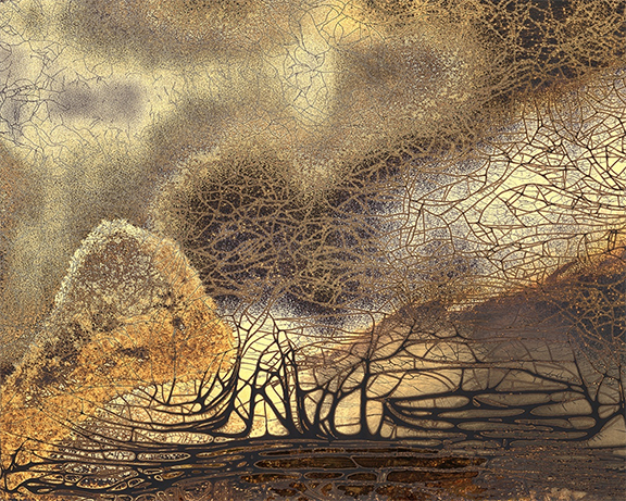
| Mike Jackson, yellow study, 2019 |
 |
| Mike Jackson, Birdsong, Summer 2018, 2018 |
 |
| Mike Jackson, Birdsong, Winter #6, 2019 |
 |
| Mike Jackson, Birdsong, Summer #20, 2019 |
Comparing these with the earlier pictures, we immediately note a heaping on of detail, a fecund proliferation of dark and light planes to imply a sense of motion where formerly the surfaces were more unitary and static, and the introduction of delicate white vectors seeking to tie everything together. The work as a result has become more restless, as if it wanted very badly to tell us something about what it's experiencing, which must be a great deal, but of course it can't. Light bounces, refracts, gets absorbed, leaks out, carves shadows, it's active. That's how it speaks. There's no sense of where it's coming from. The tension is palpable.
From this he produces accidental homages, adding to the richness: the density of pictorial constructs at the center of each image is so supercharged that it becomes nearly gear-like, recalling Italian Futurism, or, to bring it back home, the blurry operation of an early kitchen blender.
Mike has moved from the Wales of an earlier post to the "deeply historic landscape" (his words) of Wiltshire, England, where contact with the outside world from his darkroom is often limited to the sound of birds chirping, thus his titles. The prehistoric megaliths of Stonehenge loom nearby as does Lacock Abbey, the 13th century monastery where Fox Talbot in 1835 produced the first photographic negative; this immersion in great moments of human awe and discovery cannot go unnoticed or unfelt by the artist.
 |
| Lacock Abbey, cloisters |
Wiltshire's wonders don't stop with Jackson, Fox Talbot or Stonehenge, either. It's also where almost all the Harry Potter movies were made.
There must be a strange magic in the air. Jackson's lineage is most distinguished, and it's starting to show.