Thursday, December 21, 2017

Cinzia Naticchioni Rojas has an epiphany


Naticchioni-Rojas, Skins series, 2015

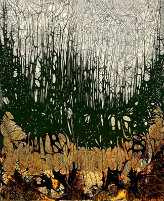
Three years ago, in her Milan studio, Cinzia Naticchioni Rojas was working with photographic prints on ceramic tiles.  She had a problem - the images started detaching and floating off their support into the water.  'It was beautiful', she says, as she observed the images floating away.  She was impressed with the tough material nature of analog images, whose substance, she felt, is really the silver gelatin itself and not the paper it is bound to, a distinction often misunderstood.  'I realized suddenly that the image floating was the true and unique essence of photography.  Obviously it messed up my tile work, but for me it was like an epiphany.'

Her head now a jumble of new ideas, she switched away from ceramics and embarked on a careful course of research to see how she could develop this insight.  Accustomed as she was to various substrates in her photographic image-making, she continued along these lines, using the black & white liquid emulsion by Rollei (similar products are available from Rockland Colloid and from Foma).  She would apply the emulsion, let it dry, put it under the enlarger, and expose images onto it of her favorite subject, clouds (Cinzia's in love with clouds, maybe it's something about their stately movement, the way their slightest displacement seems thrilling - or then maybe not, we'll have to ask her).   In any event, by early 2015 she had figured out a way to peel off the emulsion, intact, from the substrate, but then what?  Where to go with it?

An architect by training, Cinzia tends to think in three dimensions.  She looks down at the globs of wet emulsion before her and sees a potential for creating space, for this is what architects do.  Dry it, make it rigid, stand it up, wrap things in it.  Call them 'skins'.  She could set the emulsion free, free to dance, fall, slump, or rest nonchalantly, the way the rest of us do at our most unmindful, waiting for time to unfold.  She found the emulsion had a mind of its own; she accepted this.  The best part was that it was autonomous and that it seemed to revel in its own surprising existence, if we can anthropomorphize it without going too far.  Representation at this stage now becomes something quite arbitrary, something we didn't need, an appurtenance, even a hindrance, something quaint and beside the point.  A faint trace of her beloved clouds does remain if you look hard, staining the crumpled emulsion, roiled and tarnished and eviscerated.  But no matter.

Naticchioni-Rojas, Skins series, 2015


Naticchioni-Rojas, Skins series, 2015

And what a great distance the sky has come, from heaven's abode to the mud of the darkroom.  We watch her skin-objects with fascination and awe; they are like skin-castles that we want to approach and inhabit, we want to live in them, never mind where they came from.  From this moment we feel she is holding out to us something of a life without obligation, without ties and complications, like a gambol in the woods in the company of shadows.

It is on such occasions that she appears to close in on the rich tradition of cameraless photography, while advancing on it from a unique and undeveloped direction: instead of carving into the emulsion, she lets it fly, instead of creating images from gelatin and silver salts she builds structures out of them.  Happily for us, she is not 'taking a picture' any more than a chemigramist or a bleach-etcher does, though some might argue, against popular sentiment, that this is the purest form of photography because is doesn't pretend in the least to represent: it is self-reflexive, it limits itself to ponder and wonder and celebrate the physicality of its own materials.  We will not yet speak of beauty.

Naticchioni-Rojas, Skins series, 2015

Her work is now at a crossroads between so-called photography and real photography and it's too early to tell what she will do next (she may do all of it).  The 'skins' series has given us good reasons to be tantalized.


Friday, October 27, 2017

Those painted photographs

Woman in overcoat, photobooth snapshot, anonymous hand-coloring, ca 1950, private collection

It's irresistible, the desire to touch the surface of a photo with brush or pen and thereby change it into something more expressive.  Often this involves color, whether adding color to a color photo (which is not the same as bringing coals to Newcastle) or adding it to a black and white photo, but it doesn't have to.  You may remember a rather delirious post from a few years ago on zombie prints and Lazarus prints (yes, they exist), on bringing prints back to life when you thought they were hopelessly dead.  Most of the artistic interventions shown there involved using marker pens to scribble a few lines to highlight or obliterate a figure, or to make a comment, ironic or slyly humorous.  Many of those lines were black or white as though in homage to the chemistry, but color works just as well - if not better.  Today we're going to look at a few ways color has been exploited to further enhance photos in a variety of artistic practices in recent years, and from this it is hoped the reader may discover ideas that he or she can use in their own work.

Martha Casanave, Girl with device, albumen print, hand-colored, 2009-2016

Not everyone is aware that coloring a photograph, or hand-coloring as it is commonly called (or hand-tinting), is as old as photography itself.  To render the earliest portraits more realistic (always thought to be a good thing) hand-coloring appeared in the 1830s practically with the invention of photography, and soon wealthy clients had their private colorist on call, a matter in their milieu of some prestige.  Methods employed by the colorists varied according to substrate, as photographic technology passed in rather short order from metal plates (daguerrotypes, tintypes) to glass plates (wet plate collodion) and finally to paper - I'm sure I'm skipping a step or two. Often a varnish or other medium was applied to the surface beforehand to insure an even adhesion, and water colors, oils, dyes, pastels each had their devotees as the main colorant vehicle.  The many manuals written on these efforts are still worth the while to peruse for the serious student of hand-coloring and can be found on the internet.

Luis Vasquez, postcard, hand-colored, ca 1940, private collection

Yet these developments were not without their detractors in the serious photographic community: many artists saw in hand-coloring a corruption of the pure photographic tones of the emulsion, regarded as sacrosanct - although hypocritically they didn't seem to mind retouching a photo here and there with drops of inks and dyes where necessary.  In any event, their fears receded when Kodak introduced the first widely available color film, Kodachrome, in 1935, and demand for hand-coloring slid into gradual decline, becoming no longer commercially viable by 1950 except within certain traditions, like the flamboyant hand-painted postcards from the workshop of Luis Vasquez in Mexico.  Traditional hand-coloring, meaning a practice perpetuating the aims, concerns and methods of the earlier era, and often but not exclusively based on the use of Marshall's Photo Oils, a staple of the trade, has today become a niche artisanal activity with its own distinct rewards and pleasures, though perhaps limited in reach.  An excellent example of what can be achieved is seen in some of Martha Casanave's work.

So from the sixties onward artistic intentions in the use of color shifted, with acrylics and gouache beginning to assume a more prominent role; this is especially seen in work where overpainting to the edge of opacity is more crucial than simple tinting.  The painted photographs that Saul Leiter executed for his private amusement in the closing decades of the twentieth century, after making a name for himself both in fashion and in street photography, are a case in point.  In their lyricism and utter abandon, Leiter has taken the notion of painted photographs to a culmination, so much so that the underlying photograph just nominally provides the support and occasion but otherwise is hardly visible.


Saul Leiter, ca. 1990


Saul Leiter, ca 1990

Saul Leiter, ca 1990

This leads us to think about other strategies for hand-coloring, if we can be bold enough to group widely disparate approaches under a common heading.  We must step back for a moment.  At the beginning there was the classic mode of an informed realism, filling in for the poverty of monochrome photography and using materials meant not to cover up but to enliven that photography.  It is true that this later became exaggerated at times to the level of kitsch (see Woman in overcoat), but that is not to diminish its accomplishments, for out if it came a body of methods of extreme subtlety and finesse; some of this heritage is alive and well today and put to high artistic purpose - go back and review Casanave's picture Wave Machine where only the starfish gets hand-colored, the other details having glanced off into a suspicious tangle of background.

William Klein, ca 1960-1990

William Klein's aggressive daubs over contact sheets from the 1960s is a result of a different meditation, one that looks back into drawers of old prints after years and disavows or re-embraces their attitude across the gap in time with a sort of schoolboy graphism, one that prefigures Lazarus prints and confers a revivified existence while sidestepping responsibilities of ownership.

William Klein, ca 1960-1990

At another extreme is the work of Anselm Kiefer, especially that part of it set in a timeless ether of intellectual history and unfulfilled promise, where multiple shades of grey invoke a retreating but ever-present past.  Here graphite and gouachy layers over photographs of uncertain provenance serve up the general mood; in the best of his pictures the effect is disturbing.

Anselm Kiefer, Leonardo Pisano, liber quadratorum, 2008
Anselm Kiefer, Sefiroth, 2002

Though not limited to photo-based work, one of the benefits of working with photos is that you can reprint them endlessly in trying out different painted looks or ways to proceed before you have to commit.  Kim Weston in recent years has turned to overpainting his photos of models and dancers, where the method seems well suited to that theatricalized world.  Here, in a talk in Carmel, he demonstrates how he can dress and re-dress his models at will, from a given photograph, to gauge the effect.

Kim Weston, from a talk in Carmel June 30, 2012

So a photograph is more than a picture, it is an opportunity, an open invitation.  When poet and singer Todd Colby was gifted with a trove of photographer's calling-cards from the pre-WWI era, he did the natural thing, he painted them.  Here are two:

Todd Colby, hand-colored vintage calling-card, 2017

Todd Colby, hand-colored vintage calling-card, 2017
These are extraordinary in their simplicity, and show how the artist's hand can change the prosaic into something quite dramatic, bizarre, and (maybe) beautiful.  Go Todd!

To close this post let me point out what should be obvious: that hand-coloring is not limited to the subjects of the real world.  In my own work of cameraless photography, untethered as it is to anything we usually call real, I find moments when I have an overwhelming inclination to smear on some paint, just to see what it does.


Douglas Collins, etched chemigram with hand-coloring, 2016

A philosopher once said a picture can be a picture of anything, if you expand the concept of picture sufficiently.  Or maybe Todd Colby said it.


Friday, July 28, 2017

'Photography in a narrow sense': Joachim Schulz


Schulz, Vase with flowers after Daniel Seghers, before 1637, 4/9, 2014-2016

There are different ways to get into the work of Joachim Schulz, some easy, some more demanding.  I took the easy route, poking through lush masses of flowers.  Who is heartless enough to resist that?  In my carefree summer mood the other day I didn't have a thought in the world for the past or future of photography and I was happy leaving its deconstruction to others.  Today what I wanted was fragrance, vibrancy, a delicacy of depth, a fervent softness.  By the merest chance some pictures by Schulz, then unknown to me, fell into my lap, the one above being one of them, and yes, that was it - I literally stopped breathing, I was gone.  

But with Schulz there is always a backstory, as I was to learn.  There is an object lesson, as if his pictures were moral tales, and often a tipping of the hat to another tradition, old or recent, or to a trail of perception almost lost because it had no champions to claim it until now, until Schulz came along.  'I do photography in a narrow sense,' he says.  More about that in a minute - back to the flowers.  

Here's what I know: he photographed, or scanned or downloaded, paintings of flowers by Flemish masters of the 17th century, which was the great period of the cartouche, the bouquet, and the garland, when wealthy burghers regarded no home complete without a painting abrim with flowers.  In Antwerp, Ghent, Utrecht and Brussels the production of such works employed hundreds of artists, if not thousands - it was on an industrial scale - not to speak of gardeners because without them you'd be nowhere.  While this was the time of Rubens and Breughel, most of the artists chosen by Schulz dedicated themselves exclusively to floral compositions and are not widely known today beyond a small circle of specialists and fans: de Fromantiou, Byss, de Heem.  But all were excellent with brush and pigment.

Next Schulz printed out the images, but not in the usual way.  He seems to have purposely jimmied the print nozzle, or perhaps he overrode the controller of the print mechanism - I haven't spoken with the artist so I'm inferring a lot here -  to allow abnormal splurges of ink to be discharged onto the print media, whether paper or acetate.  Some of you readers may have experienced the same thing but as a problem rather than a gift, when you had a mismatch of ink and media in your inkjet.  With Schulz, this surplus ink would pool and flow randomly, to create distorted forms in some areas while leaving other areas basically intact.  He didn't rest with this though but continued on, scanning the result back into his computer and printing it out again, again with the amplified print nozzle, to obtain a variation on the first print.  He repeated these steps nine times, generating what printmakers call a 'variable edition' of nine.  Alternatively you could call each print 'unique', which is what the Von Lintel Gallery of Los Angeles does in their current show of his work, Blumenstilleben, or Flower Still Lifes.  The prints there are presented as archival digital prints and measure 50 x 35 cm each.

To illustrate the changes a single image undergoes with this method, below are the first four prints (out of nine) Schulz made from a picture that Jacob van Hulsdonck painted back in 1608.  The evolution of the piece is fascinating; in its swerves and readjustments it recalls textbook diagrams of the development of an embryo, or of a city.  The concept of time is bound up within it.


Schulz, Flowers in a glass vase after Jacob van Hulsdonck, after 1608, 1/9, 2014-16

Schulz, Flowers in a glass vase after Jacob van Hulsdonck, after 1608, 2/9, 2014-16


Schulz, Flowers in a glass vase after Jacob van Hulsdonck, after 1608, 3/9, 2014-16

Schulz, Flowers in a glass vase after Jacob van Hulsdonck, after 1608, 4/9, 2014-16

Schulz brings to the task an incisive sense of modern themes and issues, from the seriality of the variable editions to his repetitive, almost industrialized method of production, in passing by the use of appropriation - taking earlier art and reworking it - a strategy as old as art itself but which in the right hands can still seem fresh and impudent.  He is foremost an experimentalist, and his work raises questions about what it is that we're looking at when we look at a photograph: are we the subjects after all, in the end, as we try to build an image from what the world has given us?  His earlier work could be viewed as a fairly odd set of photographic queries or conundrums that circle this, without ever arriving: from studies of the faint light emanating from the stage curtains of old movie houses to an essay on the patina coating decaying German bunkers as they slip into the sea.

Schulz, o.T. #3, framed behind glass, 72.5 x145.2 x 4.8 cm, 1999-2001

As to his flower still lifes, with their quirky shapes drifting lazily off the edge of the paper, their riotous color, it all makes for a highly engaging experience, rivaling what Bobby Bashir is doing more naively out in central California, and so unexpected too when considering his past efforts which make for somewhat dry viewing, truth be told.  But these flowers!  I wish he would tell me that it's OK to love them. 


Monday, June 19, 2017

Push and chance in the work of Song and Yokota

Ajuan Song, Everything You Know About Love #5, Fuji Crystal C-print on acrylic and dibond, 11x14", 2016

There is a restlessness, a wayward energy, among young photographers today that we can no longer ignore here at the blog.  It is an energy which will take us forward to the next stage of photographic deployment, you can be sure of that; even if we don't always understand it, it is to be applauded.  It drowns all our efforts to be meticulous about pictures in the old ways.  It has been said that to invent the new you have to break all the rules.  But more and more, to our alarm and frozen fascination, it seems the young don't want to even learn the rules, they want to write their own.

Daisuke Yokota, untitled, 39 1/4 x 31", archival pigment print, 2015

Take Ajuan "AJ" Song, a young Brooklyn-based artist.  She owns a Rolleiflex but she hardly uses it anymore: when she points it at a subject she complains that too much of her world, her dreamworld, is left out.  She likes the rolling chaos instead that is the chemigram, its unpredictability, its pushback, its surprise, and the thrill she gets when at a critical moment she finds ways to intervene and subdue it - or not subdue it, because that can be fine too, she'll live with that, it's like riding a wave, it's nervy. 

AJ belongs to a tradition that dates back to the origins of the modern ethos.  John Cage had said somewhere that clarity is an obstacle to understanding; we can invent our way out of it.  In a sense that's what we do with chemigrams and it's what AJ is joyfully grappling with, splashing chemistry with abandon, consorting with ghosts.  When you see some of her pictures in the current group show at the Arte Ponte Gallery on West 20th Street (arteponte.com) you realize something else too: she has elected to display her work in the very chic and contemporary mould of heavy acrylics and dibond, not in the shopworn, fusty scheme of 'unique original work' so clamored by a diminishing handful of galleries nostalgic for an outflanked model.  There is a split in the ranks and AJ has unabashedly chosen her side.


Ajuan Song, Everything You Know About Love #2, Fuji Crystal C-print on acrylic and dibond, 11x14", 2016

Daisuke Yokota is of the same generation as AJ but has been subverting and reinventing the norms for nearly a decade and he hasn't slowed down yet.  Performance art, installations, photography, and photobooks have all been radically reimagined by him; often for example he will create a photobook on the spot before an audience and sell out the limited edition before leaving the building.  In 2015 he created a large series of color abstract photographs called, appropriately, Color Photographs, using layers of large-format color film stock which he 'developed' cameralessly and abusively with heat, light, and perhaps acids (help me out here, readers!), then scanned, blew up, possibly re-photographed (a favorite strategy of his) and printed as archival pigment prints.  The best of them have a raw unworldly beauty unlike anything I have seen.  In interviews however Yokota skirts the word 'beauty'.  He speaks of exploring the materiality of film, much the way some of us do in the chemigram community when speaking of the stubborn thereness of the photographic emulsion.  An interviewer asked him whether his work channels emotions.  'I never trust the emotional feeling in making works,' he said.  'It's too vulnerable.  I don't make work to express my feelings; it's more like burning them.'

Daisuke Yokota, untitled, 78 x 64", archival pigment print, 2015

Daisuke Yokota, untitled, 78 x 64", archival pigment print, 2015


Daisuke Yokota, untitled, 39 1/4 x 31", archival pigment print, 2015

Yokota's work has been seen at Paris Photo, Photo London, Rencontres d'Arles and elsewhere, even at ICP in New York.  Most recently the Foam Photography Museum in Amsterdam (foam.org) sent a group show to the Red Hook Labs in Brooklyn (redhooklabs.com) featuring Yokota, among others of similar avant-garde bent.  He lives and works in Tokyo.  His gallery is the G/P Gallery of Tokyo.


Monday, May 22, 2017

Denis Brihat


Brihat, Lichen, oxidation, 40x50 cm, 1975

Denis Brihat, once you see his work in person, and you really must - there's no other way to appreciate it - never leaves that part of your brain that thinks about photography.  Even when you're right up into it, even when you're literally breathing on his immaculately sculpted surfaces, you have to persevere to truly comprehend it.  How can it be so intense and focused, yet so delicate?

His subjects, they are simple: flowers, fruits, and vegetables from the garden outside his back door in the south of France - but it's then that you realize you've never seen these subjects quite in this way before.  They are transformed.  The poppies, spurges, dandelions, onions and lichens are as if touched by a hand and an eye that believes unreservedly in them, that wants nothing more than to give to these humble organisms underfoot a merited reverence in the pantheon of nature.  He places them at center stage, rendering them an austere homage.  And Denis, in ways substantially unchanged, working slowly at the rhythm of the change of seasons in the country, has been doing this for more than forty years.  His accomplishment is extraordinary.


Brihat, Lichen, photographic etching, 13x18 cm, 1981

Brihat, Wild Carrot Blossom, photographic etching, 50x60 cm, 1988


Brihat, Slice of Kiwi, iron toning, 50x60 cm, 1990


Brihat, Crumpled Poppy, gold toning, 30x40 cm, 1994


Brihat, Heart of Buttercup, sulfuration, 40x50 cm, 1999


Brihat, Yarrow Blossom, photographic etching, 10x15 cm, 1970


Brihat, Heart of Poppy, selenium and gold toning, 40x50cm, 2000

His pictures start life on black and white photo paper, but he often modifies the images through toning, beginning with selenium and marching through a fair list of the transition metals, well known for their ability to form colored compounds: gold, iron, vanadium, copper.  He also has developed his own method for treating images with sulfur compounds, which he calls sulfuration.  At its simplest, think of silver sulfide, which if left on an image after incomplete washing will produce a brownish cast.  You can arrive at sulfiding by using sodium sulfate, thiourea, or other materials, and by adjusting temperature, agitation, and concentration you may wind up, if you wish, with some nice sepia tones.  If you're new at this, try The Photographer's Toning Book (2003) by Tim Rudman, which has all the information you'll need.  Of course when Denis was starting out he didn't have that, and had to discover methods on his own.  Still, some of the books of a general nature from that earlier era remain incomparable - I'm thinking of Pierre Glafkides' Chimie et Physique Photographiques (1976, 4th ed.), which very likely inspired him in his researches.

So from the beginning, in the 1960s, Denis found himself engaged in a private, unremitting dialog with the silver gelatin of the photographic emulsion.  The primacy of silver was overthrown; in its place other metals were given their say.  Soon he began to question the place of gelatin itself.  He and his friend Jean-Pierre Sudre, similarly motivated, studied early reports on the manipulation of gelatin and gained insights from clues widely scattered over the literature.  A researcher at Kodak in England named A. Marriage had published in the British Journal of Photography (1944) a description of a way to excoriate the gelatin wherever silver grains had formed while leaving the white areas untouched, and with this in mind, or ideas very much like this, the pair embarked on a long course of experimentation, trading ideas and results over many Provençal dinners.  In time they chose what worked best and settled on a methodology, Brihat naming it 'grignotage' while Sudre favored 'mordançage'.  They shared an approach: copper chloride, hydrogen peroxide, and acetic acid, and each took it in a direction in tune with their vision.  [A modern practitioner is Brittany Nelson some of whose work can be seen in a blogpost here.]

from a retrospective in Campredon, 2012


a nook in the studio


Denis Brihat


Eventually, for Denis, the surface of a picture which had been treated with this new process - for convenience and for now we shall call the process 'bleach-etch', a name given to it by some of the first researchers - was suggestive of the acid-biting of an etching on a copper plate, with its reliefs and depressions.  He dropped 'grignotage' (nibbling) and renamed it 'gravure photographique' or photographic etching.  He liked the feeling of a third dimension, the feeling that, in a small way, it approached sculpture; it seemed to validate the notion that these fruits and flowers exist within the world, not on a flat surface, that the depth (however small) gives them the power they deserve.  Several pictures above use the technique, although the evidence is hard to demonstrate unless the reader is already intimately familiar with the technique's capablities and limitations - a large subject best left for another time.  In the hands of Denis Brihat, a consummate craftsman as well as artist, the telltale signs are concealed by his rigorously controlled redeveloping after bleach-etch, and perhaps by his fiddling with his beloved metal salts.

We are thus led back to our point of departure, that this work must really be seen to be appreciated.  You could say this of much that is great, but this time we insist.   In Paris his dealer is Galerie Camera Obscura.  In New York it is the Nailya Alexander Gallery.


Saturday, April 8, 2017

Nolan Preece goes on national tour


Preece, High Tide, 16x20", 2016

Nolan Preece's chemigrams have acquired a new look in the past couple of years, and if you haven't been paying close attention it's time you did because they are as beautiful as they are accomplished.  We first noticed his explorations into landscape in his show at the Wickiser Gallery in 2016, and this penchant is now on full display at the New York Hall of Science in a sweeping exhibit of 30 works which runs until May 21 before continuing on a national tour.

So what is new?  Well, in a way everything.  First, he has succeeded in achieving a consistency of theme that had eluded him earlier as he pursued the many delights of the darkroom.  He has managed to mesh his newfound ecological focus with a quietly balanced imagery and a more sober palette.  Gone, for now at least, are the flashy, often wanton displays of pyrotechnics that made him a revered master in both the cameraless community and among surrealists but probably cost him points with gallerists and critics.  His long career as ecologist, teacher, backpacker, and picture-framer in the High Sierra desert of Nevada has closed on him and grown its way into his art: he has begun to feel his responsibilities and they are heavy.  In the best sense his present production is a work of engagement and resolution.

So if you can't get out immediately to Queens to see it at the NYHS, we'll try to satisfy you with a few of these superb pictures.  Here goes.

Preece, In The Thicket, 20x16", 2016


Preece, Summit, 16x20", 2016


Preece, Cavern, 16x24", 2016


Preece, Riparian, 16x16", 2016

Preece, At Forest's Edge, 16x20", 2016

Preece, Woodland, 20x16", 2016

The prints are taken from the original chemigram plates as archival pigment prints on either Epson Velvet or Epson Exhibition paper in editions of 10, using the K3 inkset.  The tour will make stops, substantially unchanged, in Gadsen, AL, Anderson, IN, Elko, NV, and Macon, GA, among other destinations.  For further information contact Nolan Preece directly through his website.


Thursday, March 9, 2017

A few facts about this picture

Douglas Collins, untitled chemigram, 2016
An exhibition of chemigrams has just gone up in the project space at Manhattan Graphics Center, curation by Rich Turnbull, featuring a handful of in-house artists active in this flourishing (and doggedly frustrating) area: Edgar Hartley, Franco Marinai, Jay Judge, David Thomas, myself, and Rich.  Just local work by local folks.  Though it's only been up a few days (it runs to the end of March), it's already attracting notice around the city, not the least for the picture above.  Let me make a few technical comments about this picture, just so you don't have to keep asking and we can silence the chatterers. 

First off, it's on Foma FB, my go-to paper for chemigrams after years of experimenting with others.  To be precise - I go off precision on this quite easily - I believe it was the Foma VC FB 132 warmtone matte I was using, from an open box laying about in my chemigram shed deep in the mountains of the central California coast, but it could have been another.  It could have been the 532-II VC warmtone as well, or one of the others on baryta paper; I binge on Foma from time to time and try them all.  In this case I'm going to stick with the 132.  Or was it the 131 - but what's in a digit?

While I often can't distinguish all the subtleties in the various types of Foma, this I will say: the esteemed company's literature on what I will now call 'my paper' actually confirms my experience of it, and so I'm happy to quote them directly:

The paper is manufactured using a special silver chlorobromide emulsion that gives the silver image a brown-green to warm-brown tone that can further be influenced by the type of developer used. The paper base involved is colored in compliance with the tone of the developed silver. This accentuates a rich scale of warm halftones ranging from light cream up to saturated brown-to-green black ones. 

Note the second sentence.  It seems to say that the paper takes cues from the tone of the silver, on a shifting and certainly sliding scale friendly to brown and green; even more, it hints that secret signals are being passed for which we can only be passive spectators, that cause and effect are here incalculable or at least radically nonlinear.  Pretty amazing if true.  Those Czechs !  And I haven't even gotten to flagging the first sentence about the tone push by the type of developer, which is a job for a separate blog post altogether and perhaps a major experiment by our testing lab, the NFPTL.

I'll give you a detail that illustrates how attractive this paper can be.  Here's the bottom left corner blown up:

detail, lower left corner
When the large black area was exposed - all at once - to the action of concentrated developer, the silver halides in the emulsion were stripped of their halogens in a sudden rushed explosion of activity; now extremely dense and dark and still carrying chemical momentum, some molecules appear to have skidded off, to tarnish and embed themselves in the surrounding fringe areas previously blanched by fixer.  And I confess, this is an effect I often seek in my work, as those who know me will recognize: it doesn't happen by accident  On one level, this particular piece could be said to derive its drama from exactly this and no more.

But we should go further, we should withdraw to a larger vantage point to discuss other qualities in the picture.  How about resists, what can we say about them?  How did they fare?  There were two resists, a large flat homogeneous one in the lower part, which was Golden MSA varnish applied at full strength with a sponge brush, and a spray of Golden MSA from a pressurized can in the upper part.  The spray was applied sparingly and at an angle, so that it was least concentrated at the top and formed a penumbra at its lower border.  During the to-and-fro of the chemigram procedure, this area gradually acquired its tone, a soft mixture of lights and darks.  To get this right wasn't easy, and several attempts were discarded or confined to derivative pictures.  As for the large flat resist below it, the challenge there was to remove it in a single attack, as one piece, and keep the area beneath untouched by any chemistry until the last moment, when it was finally plunged into developer and submerged uniformly.  Again, not especially easy.

O
detail, interface
A final word: it was printed in an edition of 4 as a pigment print on Hahnemuhle Rag using the extended UltraChrome inkset for the Epson Stylus Pro 11880 printer.  The original plate, slightly smaller but otherwise identical, remains on display at Art Intersection in Gilbert, Arizona, through April 15. 

* * * * *

other current chemigram shows in New York City

Mille Falcaro, Soho Photo, February 8 - March 4
     sohophoto.com/exhibitions/archive/february-2017-exhibitions/
Eva Nikolova, Columbia University, Wallach Art Gallery, Feb 18-May 13
     columbia.edu/cu/wallach/exhibitions
Nolan Preece, New York Hall of Science, March 4 - May 21
     nysci.org/event/nolan-preece-chemigram-landscapes/